Friday 11 April 2014


1). In what ways does your media product use, develop or challenge forms and conventions of real media product?
For my media production I chose
to produce a music promo package. The song I chose for my music video was
“Imagine Dragons – Radioactive”, which belong to a hybrid genre of Alternative
Rock/Electric Rock. I decided to go against the mainstream music artists
ideology and conventions; however, I did follow the rock conventions and
challenge them at the same time. I had created a music video which do not
follow the mainstream conventions and mostly reflects independent artist’s
videos. My music video follows the conventions of independent artist’s videos and
rock music videos by focusing on creating invented and emotional effect, same
as the music has on audience. Whereas, the mainstream conventions focusing on presenting
the favourite artist/band who perform the song.
Commonly we can see in those
videos abstract montage of clips, which are edited specifically to the beat of
the song. Also, as such videos do not feature any form of performance by the
artists, they reflects the emotions through the music. In my music video we can
see that I did followed this specific convention, as I used the montage clips
which reflect the beats in the music and regarding the artist, I am not using
any performance.
 By making the hue of my music
video shadowy, I followed commonly known rock convention; which usually is
quite dark but with the high contrast levels, in order to give the video an
overall dark and edgy tone which I planned to achieve.
By making the hue of my music
video shadowy, I followed commonly known rock convention; which usually is
quite dark but with the high contrast levels, in order to give the video an
overall dark and edgy tone which I planned to achieve. 
Whereas, as I mention before I
challenged the convention by using artistic view point, and do not showing my video
through performance of the artist. The rock music videos are usually incredibly
performance based, shots which are used covers the whole band playing, but
still mainly focusing on the front vocalist. I decided that even as the song
which I chose for my music video is played by band Imagine Dragons which do
perform in their real video, I wanted to show the emotions which would
highlight the tone of the song rather than present the performance of the band itself.
 By using different layers on top
of another, I needed to reduce the capacity of top ones in order to create
ghosting effect which in my opinion reflects the feel of the music and its
lyrics; by forming a fascinating and hypnotic outcome. This particular
technique interest me and catch my eye thus influencing me to create an
abstract layers which focus more on moving images rather than on artist. Such
convention is not seen in common rock music video, but is more likely to be
seen in independent artist’s videos. Even in narrative rock music videos many
shots focus and present the band performing.
By using different layers on top
of another, I needed to reduce the capacity of top ones in order to create
ghosting effect which in my opinion reflects the feel of the music and its
lyrics; by forming a fascinating and hypnotic outcome. This particular
technique interest me and catch my eye thus influencing me to create an
abstract layers which focus more on moving images rather than on artist. Such
convention is not seen in common rock music video, but is more likely to be
seen in independent artist’s videos. Even in narrative rock music videos many
shots focus and present the band performing. 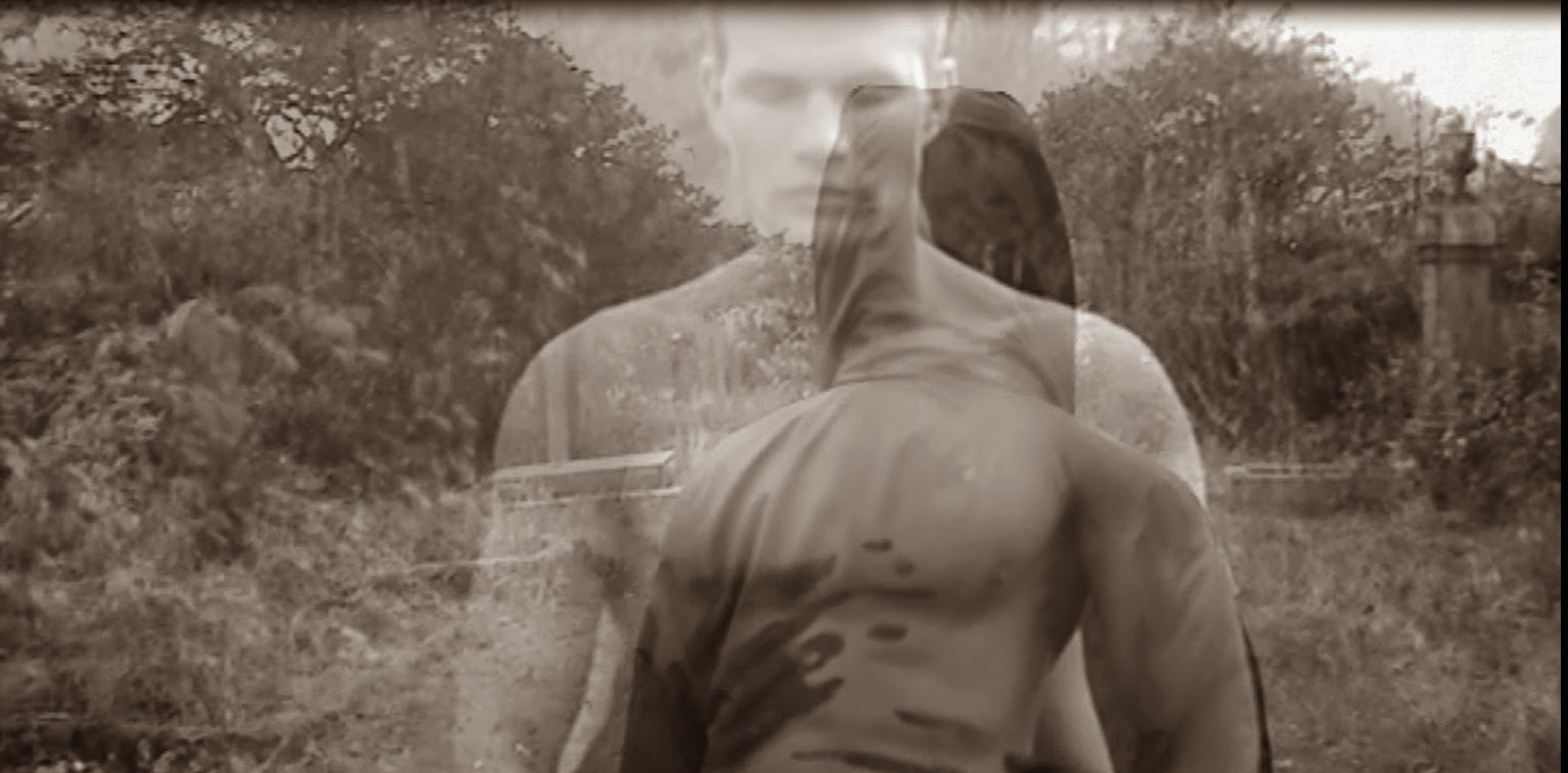
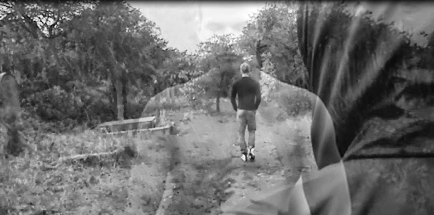
Regarding the editing conventions
which are used in rock videos, is usually snappy and fast paced to match the
normal fast tempo of the song, but I have used the slow and fast motion effects
which underline the particular parts from the song lyrics; like inhale and
exhale the air. In my opinion, this creates a feeling behind the music and
reflects the emotions of an artist who sang it. We can still see the Kevin’s face
who inhales the smoke, which I have created by reversing the shot in which he
exhale the smoke and add the layers on top of each other, reducing the capacity
of the top one ending up with the planned result.

I thought that I could present
the ideology of the song behind the story of my music video. The creative way
of showing the feeling of an artist at that moment and to let the audience feel
the effect of the nightmare which he feels inside and outside himself.
 I planned to create a
metaphorical and surrealistic world in which he is watched and followed by
antagonist character, who reveals to be him from the beginning at the end of
the video. I wanted to give a sense of mystery by using antagonist character, which
wasn't introduced to the audience and therefore gives an enigmatic look to my
video.
I planned to create a
metaphorical and surrealistic world in which he is watched and followed by
antagonist character, who reveals to be him from the beginning at the end of
the video. I wanted to give a sense of mystery by using antagonist character, which
wasn't introduced to the audience and therefore gives an enigmatic look to my
video. 
Moreover, as I planned from the beginning
to create an abstract video, I can see that I also used a simple narrative
story as it tells the audience what is going on in the video and how it should
be interpreted. The rock music videos are also using narrative story lines however;
it is very likely that they would show many shots of the band performing the
song. I challenged this convention by creative an abstract video with artistic
perspective which gives an audience the freedom to understand but also
interpret my video form their own perspective.
 Nonetheless, I do follow the
convention of using the dark story line, which matches the dark sound of the
music and deep meaning of the lyrics. Also, I used and at the same time
challenge the conventions of costume which my character wears. In real rock
music videos the performers are usually dressed completely in black clothing,
appearing as stereotypical rock/metal listeners/performers with multiple
piercings, dark makeup, and a dark and edgy demeanour. Whereas, I used more
modernised style of dressing; jeans, black jumper, white t-shirt and black
jacket, without use of any make up. However, the use of props in my video is
conventional for rock music videos, as I am presenting my artist while he’s
smoking what is well known and often seen in rock videos.
Nonetheless, I do follow the
convention of using the dark story line, which matches the dark sound of the
music and deep meaning of the lyrics. Also, I used and at the same time
challenge the conventions of costume which my character wears. In real rock
music videos the performers are usually dressed completely in black clothing,
appearing as stereotypical rock/metal listeners/performers with multiple
piercings, dark makeup, and a dark and edgy demeanour. Whereas, I used more
modernised style of dressing; jeans, black jumper, white t-shirt and black
jacket, without use of any make up. However, the use of props in my video is
conventional for rock music videos, as I am presenting my artist while he’s
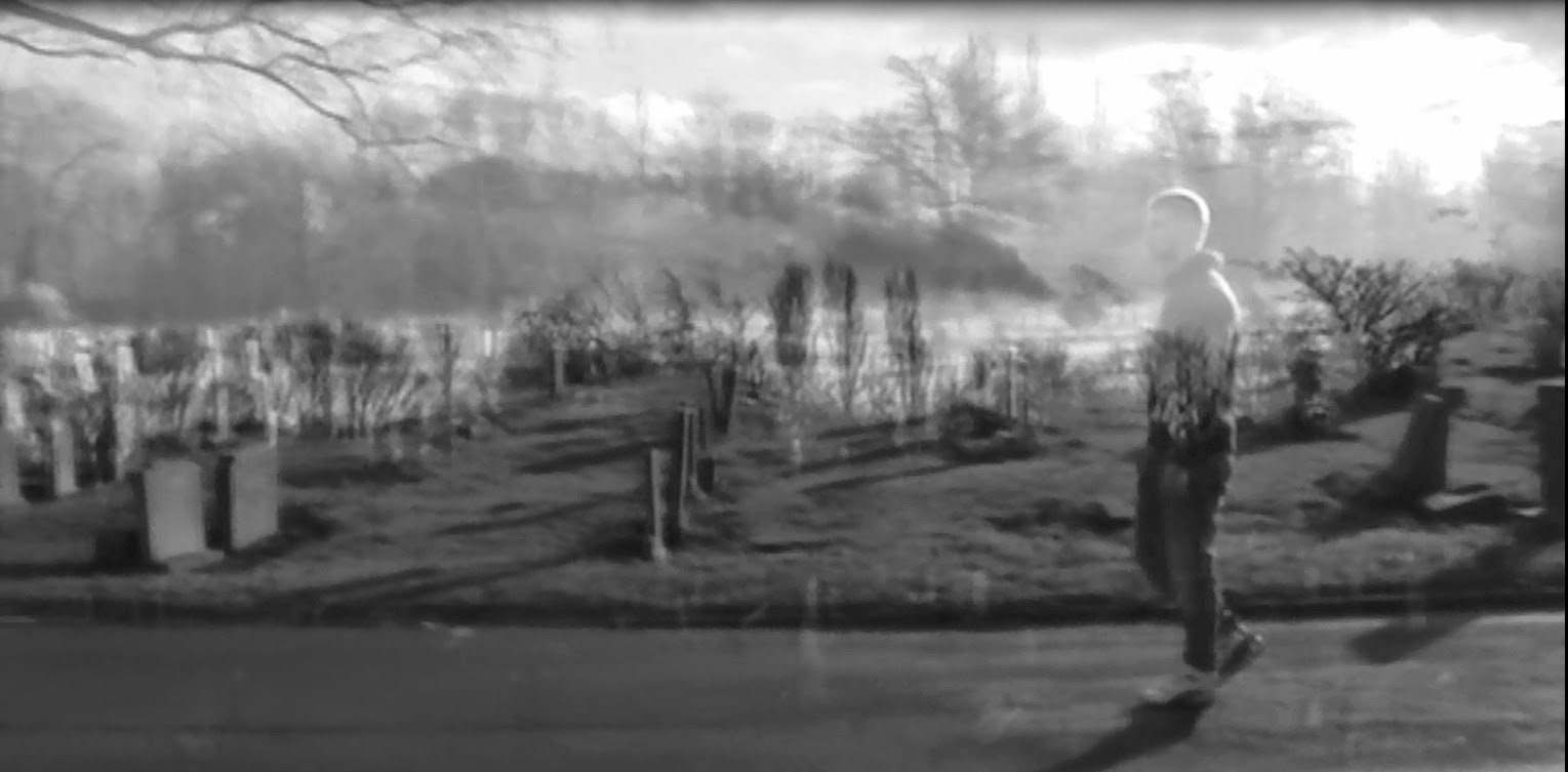
smoking what is well known and often seen in rock videos. 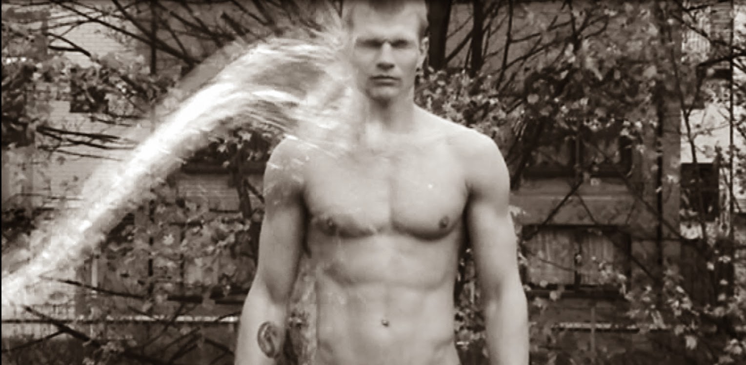 In my opinion my music video is
self-reflective, because we can see an extreme close ups in which Kevin is
directly looking into the camera; creating direct eye contact with the viewers
but at the same time he is aware of the camera which follows him what is
postmodern. Then after he is closing his eyes in first seconds of the song we
can see a long shot which reveals him walking from behind the camera which
immediately draws the audience into its fictional nature of a nightmare, which
I planned to achieve from the beginning.
In my opinion my music video is
self-reflective, because we can see an extreme close ups in which Kevin is
directly looking into the camera; creating direct eye contact with the viewers
but at the same time he is aware of the camera which follows him what is
postmodern. Then after he is closing his eyes in first seconds of the song we
can see a long shot which reveals him walking from behind the camera which
immediately draws the audience into its fictional nature of a nightmare, which
I planned to achieve from the beginning. 2). How effective is the combination of your main product and ancillary texts?
My
product and ancillary texts combined with each other at overall effect very
well. I kept the continuity of my house style in each of my products, as both
my video and ancillary texts are presented in black and white noir theme. At
the beginning of creating my ancillary texts I took large amount of images of Kevin,
which was the simplest task from all. Afterwards, I needed to make a decision
which of these images would reflect and match my video in best way. I concluded
with images taken from photo session and the screenshot from actual video.
I tried a numerous different font styles
within the images, to make sure I would use the appropriate one which matches
the theme and genre of my music video. I placed the text below the artist as I
decided that it would highlight his importance and match the house style of the
rest of my ancillary texts. I had separate the name and surname of my artist by
using different colours of black and white, and in order to match the album
name with it I decided that I would split the ‘radioactive’ into two words by making
‘radio’ white and ‘active’ black. The significance separating these two words
was that I wanted to appeal to the audience by sending metaphorical message
‘Kevin Strong’ is ‘Radio Active’.
After
I sorted out the images which I would use for my digipak and advert magazine, I
started to use the Adobe Photoshop CS5 and PicMonkey.com website to ensure that
the images got dark edge tone and the hue is shadowy. The image which I chose
to include in my magazine advert is the same one which I am using for my front
cover, because as I done a research about magazine adverts I find out that in
most cases they are using the front cover picture in order to make it easier
for an audience to find advertised album.
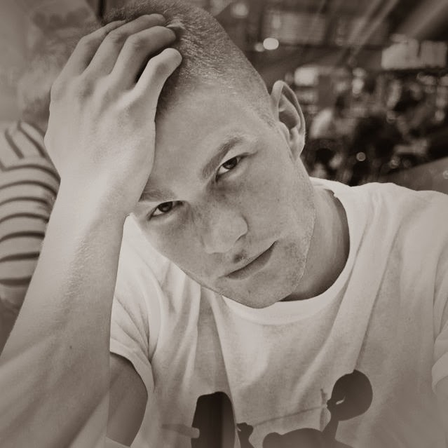
I
decided that this photo would be suitable as is showing the direct contact with
the audience and is effective in its simple way. After editing the picture I
blurred the background in order to focus only on Kevin, not because he is the
most important but to highlight the idea of being “alone”, even when he is
surrounded by people around him. This idea matches the concept of my video as I
am using the form of a nightmare in which he fined himself. Also, the
continuity was kept by using the noir theme in each of my product like I
mentioned before.
 |
| After Photoshop |
 |
| Before Photoshop |
Before
deciding which font I will use in which product, I created an image with
variety of fonts with name of an artist and album. I then began to create my
final magazine advert, after undertaking the research I realise that in the
most magazine advert’s the main image is presenting the artist and in come case
the album cover. The pictures are taken by use of close-up or just simply
relates to the album. The text is the largest and mostly uses the font which
catches the audience eyes, and that’s why I decided to include the text below
and above the picture to not crash the effect which it would have on an
audience and to avoid covering it. Also, the text includes my album name and
the artist name. In the corners we can see the logos of the companies which
promote and distribute the albums. The colours are matching the noir theme and
the text matches the logos. The background is black to establish the text and
make it more visible. I was trying to make it as much realistic as I could, to
have an impact on an audience.

I
decided that I would name my artist “Kevin Strong” I wanted to keep his real
name and also highlight him by using solid surname, as I did not like the idea
of a nicknames because they are mostly used in mainstream music and are
unconventional for the rock music genre. The album name came easily as I named
it after the real track name “Radioactive”, as this convention is used in every
genre; naming the album after the main track in it.
Then
I started to add some personal information of an artist in form of his website,
if the fans would like to contact him, and also to make my advert more
realistic as I learn after my research. After that I add the simulacrum of
Amazon website logo and Lava logo. I made that decision to make my product
realistic as much as it was possible and professional, and also to make it
easier for audience to find my product.
In order to create my digipak, I
made the decision to mix the images I had taken and the snapshots from my actual
music video as some of the shots were visually attractive and would highlight
the link between the album and video. The image used inside, next to the back
cover, were the only one which I include in the album, because is presenting
the shadow character who supposed to stay unknown for the audience till very
end to keep the continuity of mystery in between the products. Moreover, I
created my own record label called “X – record label”, which added the
effectiveness to my product and make it more realistic. I decided to create my
own record label after researching other exiting products; I thought that I
would be good idea to make the record label on my own in and kept the
continuity of the font style and shady look.
The idea for my back cover look,
I had taken from Rihanna’s album after researching existing products. I liked
the way it matches the rest of my album and decided that I will spend some more
time to make it better. Initially, the back cover was presenting the image as a
whole with track names listed on the right hand side, however, the final effect
did not match the continuity of the rest of my ancillary texts, so I needed to
evaluate it. I had cut the image to fit it in the left hand side and the other
half I included in the right hand side. Both images have been photoshop in the
same way to keep the steadiness between the pictures. Next I needed to shade
the right hand side image, in order to make the text visible and easy to read.
The line crossing the images creates an effect which I wanted to achieve. I had
reverse the image presenting Kevin, because I wanted to make him faced the
other half of the back cover, achieving the effect as he would be looking at
the track list. As I learnt by understating my research, the records label logo
with bar code. Including my own record label with generated bar code I tried to
avoid covering an image and any text included in my back cover, due to that I
move the left hand side image presenting Kevin up, and placed the both bar code
with my record label logo in the left hand side corner evading covering
anything what is necessary and still keeping the planned effect.


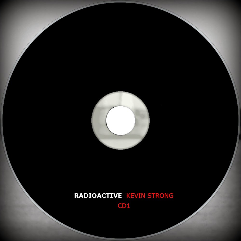 I used the Adobe Photoshop CS5 in
order to achieve the planned effect of dark edgy tone on both of my CD’s. I
made them the same, including the name of an album which I chose before, “Radioactive”
with the name of the fake artist as I do not presenting the band. This is going
against the alternative rock conventions as mostly this music is played by the
band but in my case I decided to show one artist which could be seen as a
character as he is not signing in the video clip, and present him in the album
cover. I choose the actual name of my artist which is Kevin and added the
surname which would still in the memory of the audience Strong. The font style
which I chosen is simple and easy to read, as after analysing the variety of
album covers from this particular genre I liked the Fun album and One Republic
album, for its font style and the visual look. I am using the Verdena (regular)
font style which is different from the font that I used in the magazine and
album cover. I made that decision after trying numerous of fonts which did not
meet my requirement, as I wanted to create something delicate and smooth. I
make my both CD’s in black colour to don’t undermine the covers and inside
images of my album. Also, I decided that if I am using the dark and edgy tone
that would be most suitable in order to keep the continuity in between my
products. The background in which the CD’s are places are shady and misty, the
image I have used been taken from one of videoing sessions and present the
Humber Bridge Sea. I took that idea from exiting product after making my
research and planning.
I used the Adobe Photoshop CS5 in
order to achieve the planned effect of dark edgy tone on both of my CD’s. I
made them the same, including the name of an album which I chose before, “Radioactive”
with the name of the fake artist as I do not presenting the band. This is going
against the alternative rock conventions as mostly this music is played by the
band but in my case I decided to show one artist which could be seen as a
character as he is not signing in the video clip, and present him in the album
cover. I choose the actual name of my artist which is Kevin and added the
surname which would still in the memory of the audience Strong. The font style
which I chosen is simple and easy to read, as after analysing the variety of
album covers from this particular genre I liked the Fun album and One Republic
album, for its font style and the visual look. I am using the Verdena (regular)
font style which is different from the font that I used in the magazine and
album cover. I made that decision after trying numerous of fonts which did not
meet my requirement, as I wanted to create something delicate and smooth. I
make my both CD’s in black colour to don’t undermine the covers and inside
images of my album. Also, I decided that if I am using the dark and edgy tone
that would be most suitable in order to keep the continuity in between my
products. The background in which the CD’s are places are shady and misty, the
image I have used been taken from one of videoing sessions and present the
Humber Bridge Sea. I took that idea from exiting product after making my
research and planning. 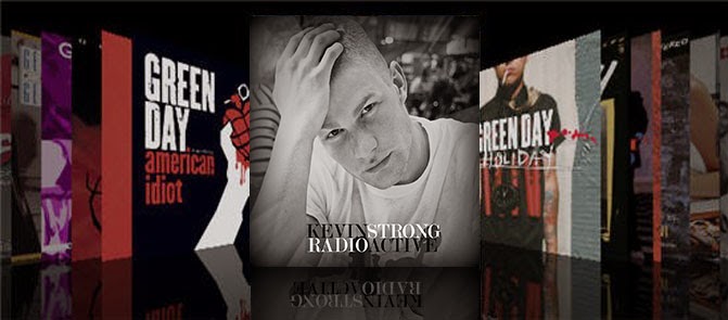 In creating my digipak, I realise
that the most difficult aspect in achieving was to keep the continuity between
the images. On the other hand, I needed to ensure that the digipak linked the
magazine advert and music video as a whole. I portray my digipak in real life
setting by using real media products of iTunes shop. In order to achieved this
effect I needed to reduce the opacity under the front cover to create a real
product effect and to see how it would look like in between the real media
texts. I figure it out that it would be the simplest way of accessing my
product by audience as iTunes is the most popular media source used across the
world. Overall I think that my product meets the requirement and would be
effective in real life settings.
In creating my digipak, I realise
that the most difficult aspect in achieving was to keep the continuity between
the images. On the other hand, I needed to ensure that the digipak linked the
magazine advert and music video as a whole. I portray my digipak in real life
setting by using real media products of iTunes shop. In order to achieved this
effect I needed to reduce the opacity under the front cover to create a real
product effect and to see how it would look like in between the real media
texts. I figure it out that it would be the simplest way of accessing my
product by audience as iTunes is the most popular media source used across the
world. Overall I think that my product meets the requirement and would be
effective in real life settings. 3). What have you learned from your audience feedback?
I decided to show my video and ancillary texts to the
variety of people in different age groups, but still focusing on my target
audience. After I present my product to them I ask them to fulfil the
questionnaire which would provide me with variety of answers and opinions about
my product and what could be improved in them opinions. I wanted to attract a
different kind of audience between the ages of 16-25 years-old.
 My product targeted both a male and female audience,
however, as the statistics from the questionnaires proved the females are more
likely to be attracted by this kind of music genre and the artist who take part
in it. On the begging of my research and planning I decided that by presenting
the male artist I would be referring my product more to the female audience, so
before starting to create my ancillary texts and my music video I showed the
picture of Kevin to several females, asking them what they are thinking about
his appearance. As a result I realise that they liked the way he looks, so I
decided that I would make my product more appealing to them rather than males.
By doing so I am going against the Laura Mulvey theory of a Male Gaze. She
argued that females presented in the music videos are presented as a sexual
object for pleasure of a man, whereas I am going against this theory, by
presenting a man as a sexual object for a pleasure of female audience.
My product targeted both a male and female audience,
however, as the statistics from the questionnaires proved the females are more
likely to be attracted by this kind of music genre and the artist who take part
in it. On the begging of my research and planning I decided that by presenting
the male artist I would be referring my product more to the female audience, so
before starting to create my ancillary texts and my music video I showed the
picture of Kevin to several females, asking them what they are thinking about
his appearance. As a result I realise that they liked the way he looks, so I
decided that I would make my product more appealing to them rather than males.
By doing so I am going against the Laura Mulvey theory of a Male Gaze. She
argued that females presented in the music videos are presented as a sexual
object for pleasure of a man, whereas I am going against this theory, by
presenting a man as a sexual object for a pleasure of female audience.
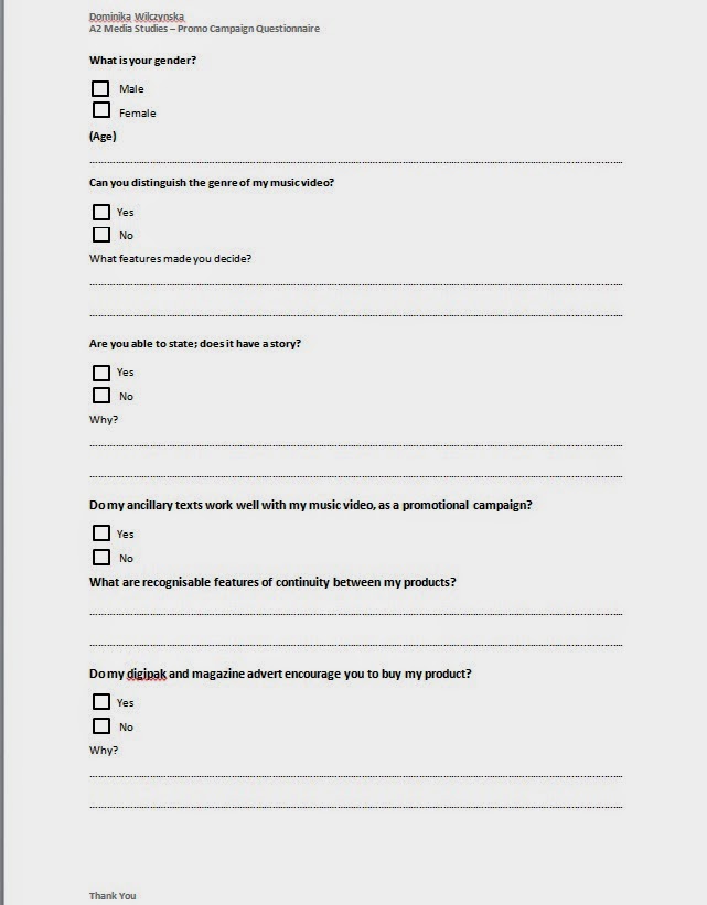
From these feedbacks I learnt that the majority of an audience
was able to distinguish the genre of my music video by the features I have used
within my video. Also, they were able to state that my video had a story from
the beginning till the end. They as well decided that both my music video and
ancillary texts work well with each other by keeping continuity of noir theme
and edgy tone. There were diverse decisions whether or not they’re would buy my
album, but the majority answered yes to that question, what proved to me that
my product could succeed in real life.
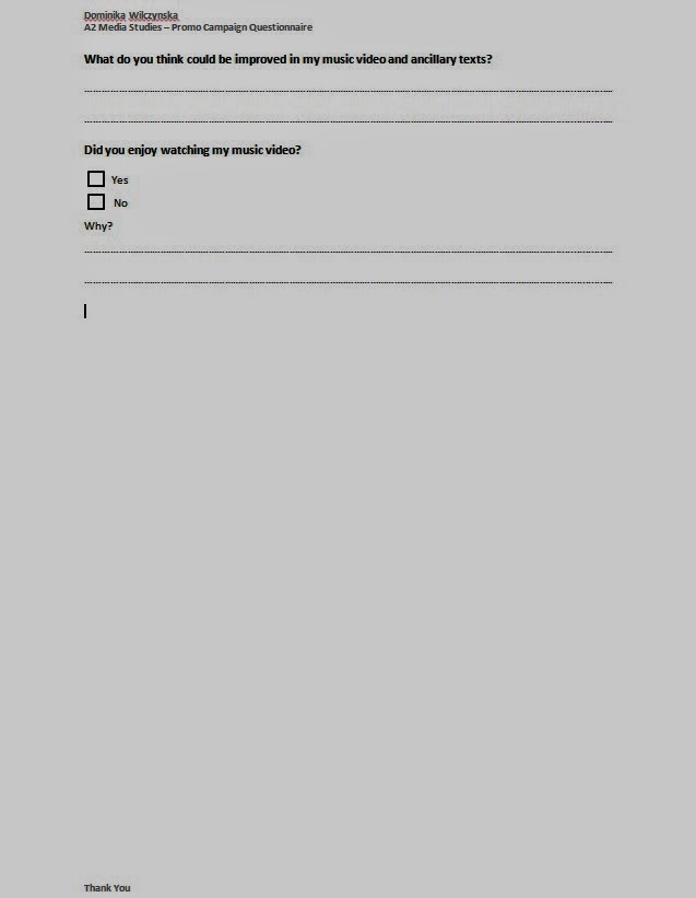
When I asked the people about any possible improvement
which could be made in order to make my music video better, the majority of
people agreed that the recap which I am using at the end of my video should be
fast-forward. But despite this fact all of them answered yes when I asked them
“did you enjoy watching my music video”.
After analysing the audience feedback I made the
following changes to my music video to improve it. I fast-forward the recap and
add additional shots which were mixed in order to avoid the montage effect, I
had slowed down the water shots and made few cuts to the other shots to make
the video matches the beat. Also, I used the white flashes instead of blackouts
to match the fats tempo and beats which are highlight of this song. Finally, I
replace the shots which were to dark and crashed the overall effect and change
the ending by keeping the black and white style.
I personality think that my music video could be better
if I would use better quality camera and do not shot in the dark as I had done
in few scenes. And also instead of splashing the water on Kevin I could shot
him draining in the water which I think would have a better impact on audience
opinions.
Moreover, from my online pull questionnaire I found out that the majority of people who answered on my questions were females between the ages of 16-17. The same amount of votes achieves the pop/rock/metal/alternative and indie genre, which indicated my good choice of song genre as I targeted the planned audience. Also, as the biggest amount of votes achieved the mise-en-scene convention, I think that by using variety of locations and costumes I fulfil their needs. I have used the abstract story which reveals to be also narrative, I am pleased as majority of people choice narrative type of music video which they prefer to watch and as reveals in my promotional campaign questionnaire the audience were able to distinct the story in my music video. The YouTube get highest vote rate in terms of how people watch the music video, so after uploading my music video in my channel I am hoping it would prove its effectiveness. The black and white theme and both themes answers, achieved the same voting rate, what satisfied me as I am using the noir theme as a main in both of my products in order to keep the continuity between the products.
Concluding, after analysing both promotional campaign and online poll and end up with deduction that I am targeting the females in between the age of 16-20 year-olds and that I am up to date with the modern trends of alternative rock music as song radioactive is very popular and liked by my chosen audience.
.jpg)
.jpg)
.jpg)
.jpg)
4). How did you use media technologies in the construction and research, planning and evaluation stages?
I have used many different media technologies while I was creating my research
and planning and also, for my music video and ancillary texts. I can start with
the Blogger.com website to hold my entire portfolio and keep the records of my development
process in form of research and planning.

Moreover, I have used the Adobe Premier Pro CS6 as mine main media
technology in order to create my music video and outtakes video, installed onto
an edit suite. Firstly, what I needed to do was to upload the footage which I decided
I will use in my video and named them to make it easier by re-creating the
storyline. This programme allowed me to cut the bits which I did not wanted to
use and re-size the shots and use the special effects. As mainly I am using the
special effects of slow and fast motion, understanding of how to use it was
crucial for me in order to achieve the planned effect. Also, this programme
allowing reversing the shot and creating the ghosting effect by putting the
layers on top of each other and reducing the volume of capacity. I have no
previous experiences with this programme and therefore I needed to spend more
time on understanding and learning which tool is responsible for what. I chose
this programme over alternative mediums which were available.

I used the Windows Movie Maker while creating my animatic but the
programme were to too complex which enable only the cutting and placing the clips
with changing the colour, reducing the volume of the sound and allowing to add
transitions in between the cuts. So it wouldn’t be suitable in use for my final
product of my music video as I wanted to make it as much professional as it was
possible.

I also used the YouTube to post the videos of my first draft, audience
feedback and final video. This system is allowing the users to like, dislike
and comments with rating options the videos which are uploaded and distributed.
I chose this media as is very popular and the service shares the post over the
media technology like; Gmail, Facebook and many other, on which I also distributed
my product.

I chose to use the Sony Carl Zeiss (Vario-Tessar Optical Zoom 40x)
camera with which I shoot all of my footage for my music video. This camera
allowed me to keep all of my content on a memory card and also transfer others
by using the cable.
By using the Prezi numerous times I saved the space and also make the information
which I wanted to present more interested for a reader. I was able to express
my ideas in a visual and attracted form. This includes the elements of my
evaluation such as techniques used in Photoshop or the genre conventions. This service
allowed me to post the images, videos, texts and any other shapes into one
place and put them together in an easy form to read.

The Adobe Photoshop CS5 was a media technology known for me as I learnt
a lot of it from main previous year of studying media. I used this programme in
order to create my ancillary texts. With this programme, I was able to edit my
photographs effectively using colour adjustment tools, crop and re-size images,
create numerous amounts of text using layering and overall create my ancillary
texts in a way I planned. This programme enabled me to make my ancillary texts
look professional and realistic overall and in comparison to other mediums.

Lastly I used the SlideShare which enable me to transfer any
presentation file into the interesting and easier form of media technology.

Monday 7 April 2014
Subscribe to:
Posts (Atom)